Posts

Showing posts from April, 2020

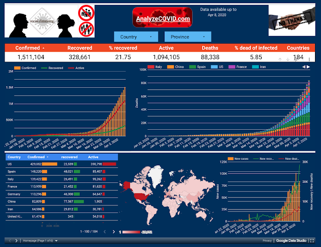
RAG Viz added to covid-stats.de

Image
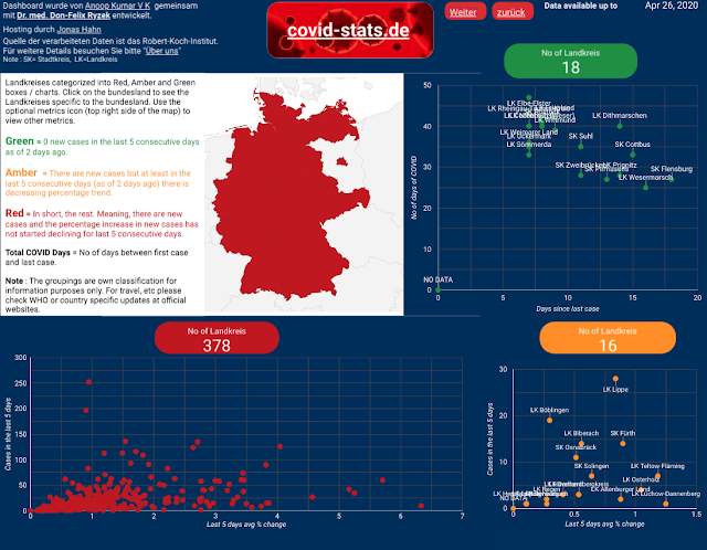
The RAG (Red, Amber, Green) visualization (image 1) is now also added to the  covid-stats.de dashboard (page 2). It provides some more interesting information. It provides a quick overview of cities/towns that are coming out of COVID-19 and those that are nearing the end of COVID-19 situation within Germany. By clicking and selecting the bundesland it filters out (image 2) to display the cities/towns of that particular bundesland. Using the optional metrics (icon on the top right of the map) one can also get information about last 5 days total cases (image 3), last 5 days average % change, etc. 

RAG Viz added to AnalyzeCOVID.com

Image
The RAG (Red, Amber, Green) visualization has been now added to the analyzecovid.com dashboard. Goal is to get a quick overview of countries that are coming out of COVID-19 and those that are nearing the end of COVID-19 situation.

BI Architect course and BI Tool question

Received two questions, 1 through LinkedIn and other through blogger. Sharing details of Q&A here for the benefit of wider audience. Question 1:  I want to start with a career in BI, and I am planning to get trained in it. The institute covers MSSQL, Power BI, MSBI, Tableau desktop 10, Informatica developer and admin, Azure data factory, SQL DBA, QLIK sense, Data warehousing. Is this all that is needed? Reply : Regarding getting into BI, the best way is to get into a team where you can learn from experienced people in the team. Regarding courses, just based on the list, that's quite a lot for a training, but it depends on what exactly is provided as part of the training. Need more details about the training. Then once the link was provided, I had a check and provided below reply. Note - Link or institute name is not shared here intentionally to avoid any confusion that I am promoting any institutes.  Reply :   I have had a look into the link, as a course for a b

Datapathy - Feelings of data?

Image
Usually when it is technical content I post it here in akvkbi.com and when it is emotions I post it in  my other blog  akclarity.com   to keep facts separate from emotions. But, this time it is a combination of two; it's data and an imagination of what data would feel about BI (Business Intelligence), so posting it in both the blogs. For those who understand data and BI relationship this should resonate. I hope to cheer up all of the data and BI professionals and bring some positivity in these tough times.   Note : Pdf version has been made available so that you can download easily, share it, take a print out, etc. 

COVID-stats.de

Image
In collaboration with Dr.med. Don-Felix Ryzek , who is on the COVID floor treating patients, an interactive dashboard ( https://www.covid-stats.de ) has been built to help dig deeper into the details about Germany's current situation with COVID-19.   For quick reference Fälle = Cases , Todesfälle = Deaths, genesen = Recovered, Verdopplungszeit in Tagen = Doubling rate in days, Gesamt = Total, M= Men, W=Women, U= Unknown

AnalyzeCOVID.com

Image
The Corona Virus dashboard has been upgraded and embedded into AnalyzeCOVID.com website for better readability. So you no longer have to store/remember the long URL of Google Data Studio dashboard instead can easily remember the website address of AnalyzeCOVID.com . This site is mainly for those users who are interested to dig deeper and understand the numbers better and search for trends, patterns and anomalies. 

Popular posts from this blog

ETL developer vs Data engineer

3 years of IBI